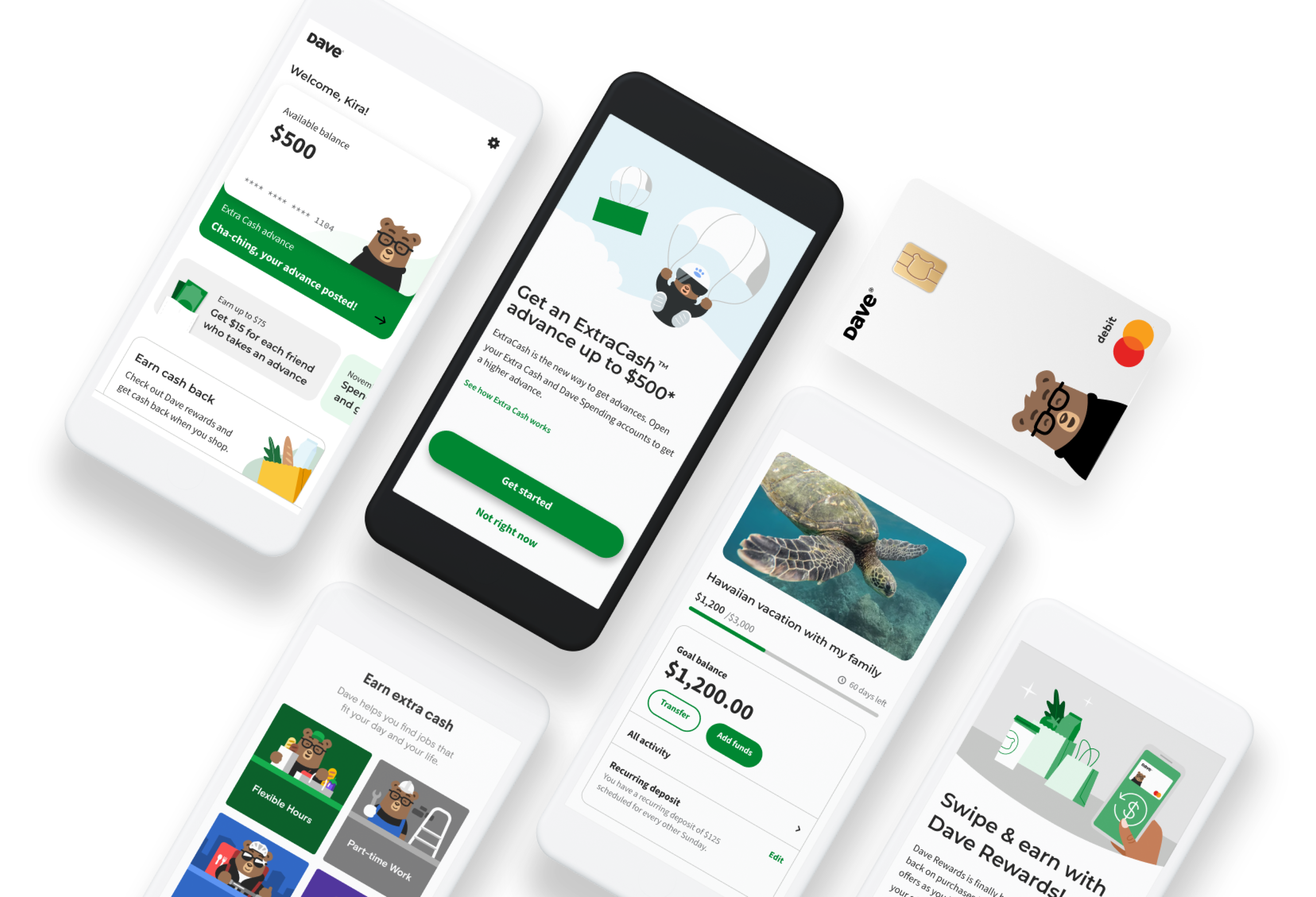
Peer-to-Peer + Extra Cash
Designing a social money flow for users who need quick financial support
As Product Designer at Dave, I explored a Peer-to-Peer experience connected to Extra Cash, designing research, user flows, wireframes, and high-fidelity screens to help users request, send, and receive money in a simple and trusted way.
About Dave
Dave is a financial app that helps users manage everyday money needs through features like Extra Cash, spending tools, banking products, and financial guidance.
The product is especially focused on helping people avoid financial stress, access short-term support, and manage their money with more confidence.
The opportunity
Peer-to-Peer + Extra Cash
Extra Cash already helped users access money when they needed it. The opportunity was to explore how Dave could also support money movement between people — especially in moments where users rely on friends, family, or trusted contacts for help.
The idea was to create a flow where users could request or send money in a way that felt fast, clear, and emotionally safe.
My role
As Product Designer, I worked on the early product exploration and design direction for the Peer-to-Peer + Extra Cash experience.
I focused on understanding user needs, mapping the flow, exploring interaction models, and designing low-fidelity and high-fidelity screens.
I contributed to:
- User research planning
- Research questions and assumptions
- Persona definition
- User journey and user flow
- Low-fidelity wireframes
- High-fidelity mobile screens
- UX writing considerations
- Interaction and product logic
- Key learnings and recommendations
Problem statement
People often need small amounts of money quickly, especially during moments of financial pressure.
But asking someone for money can feel uncomfortable, confusing, or stressful. Users need a way to request or send money that feels simple, transparent, and trustworthy.
The design challenge was:
How might we help Dave users request and send money through trusted contacts while keeping the experience clear, fast, and low-friction?
Project goals
- Explore a Peer-to-Peer experience connected to Extra Cash
- Help users request money from trusted contacts
- Make sending and receiving money feel simple and secure
- Reduce friction in moments of financial urgency
- Create a mobile-first flow that fits naturally into Dave’s ecosystem
- Understand user expectations around trust, repayment, and money requests
- Translate research insights into wireframes and high-fidelity screens
Design approach
Designing for urgency, trust, and emotional comfort
This feature was not only about moving money. It was about designing for a sensitive moment: asking for help.
My approach focused on reducing emotional friction, making the steps feel clear, and helping users understand what would happen before they confirmed an action.
The experience needed to feel fast, but also safe.
User research
Research objective
The goal of the research was to understand how users feel about requesting money from people they know, what information they need before sending or receiving money, and what would make the experience feel trustworthy.
Research questions
- When do users ask friends or family for financial help?
- What makes asking for money feel uncomfortable or stressful?
- What information do users need before sending or requesting money?
- How do users think about repayment, timing, and trust?
- What would make a P2P money flow feel safe inside Dave?
- How could Extra Cash and P2P support each other in the same ecosystem?
Key insights
Users need clarity before action
When money is involved, users want to know exactly what they are sending, requesting, receiving, or committing to.
Trust is central
A P2P feature depends heavily on trust. Users need to feel confident about who they are interacting with, what the request means, and what happens next.
Money requests are emotional
Asking for money can feel vulnerable. The flow needed to feel respectful, direct, and not overly transactional.
Speed matters
Users looking for cash support are often acting under pressure, so the experience needed to be quick and easy to complete.
Persona
Meet the user
The target user is someone who needs short-term financial support and wants a simple way to ask for or send money through people they trust.
They may already use Dave to access Extra Cash, avoid overdraft stress, or manage tight financial moments.
Core need:
“I need a fast and clear way to get help without making the situation feel awkward.”
User flow
The user flow mapped the main actions a user could take inside the P2P experience:
- Start from Extra Cash or money movement entry point
- Choose whether to request or send money
- Select a trusted contact
- Enter amount
- Add optional context or note
- Review details
- Confirm request or payment
- See confirmation and next steps
The goal was to make the flow feel direct, predictable, and easy to understand.
Wireframes
The wireframes explored the structure of the experience before moving into visual detail.
This phase focused on:
- Entry points into the feature
- Amount selection
- Contact selection
- Request and send-money logic
- Confirmation screens
- Empty states
- Error and waiting states
- Clear calls to action
The purpose was to validate the flow and interaction model before refining the interface.
High-fidelity screens
The high-fidelity screens translated the flow into a polished mobile experience aligned with Dave’s product language.
The final screens explored:
- Request money flow
- Send money flow
- Amount confirmation
- Contact-based interaction
- Success states
- Extra Cash connection points
- Clear review screens before confirmation
These screens helped show how the feature could live naturally inside Dave’s ecosystem.
Outcomes
Explored a new money movement experience
Designed a Peer-to-Peer concept connected to Extra Cash, expanding how Dave could support users during moments of financial need.
Created a clear end-to-end user flow
Mapped the experience from entry point to confirmation, making the feature easier to understand, evaluate, and discuss with stakeholders.
Turned research into product direction
Used research questions, persona work, and behavioral insights to guide the flow, UX decisions, and screen structure.
Reduced complexity in a sensitive flow
Designed the experience around clarity, trust, and emotional comfort, especially for users requesting financial help.
Delivered wireframes and high-fidelity screens
Created low-fidelity explorations and polished mobile screens to communicate the product vision and support future iteration.
Key learnings
Financial products are emotional
Even simple money actions can carry stress, embarrassment, or urgency. Designing for fintech means designing for both the transaction and the feeling behind it.
Trust needs to be designed into every step
For P2P experiences, users need clear confirmation, recognizable contacts, transparent amounts, and predictable next steps.
Simple flows are not always simple problems
The interface may look minimal, but the logic behind requesting, sending, confirming, and receiving money needs to be carefully structured.
Research makes sensitive flows stronger
Understanding how users think and feel about asking for help helped shape a more respectful and human experienc


